Growing up in the 1980’s, our kitchen countertops were canary yellow. My mother drove a light blue Plymouth Valiant and our den boasted a sweet, avocado green shag carpet.
Things are different today. We are slowly removing color from the world. Perhaps in an effort to not offend anyone. Everything around us is getting more muted, more washed-out, and more “greige”. We’ve replaced color with calm. Boldness with beige. Whereever you are right now look up and see if you can find the color red. (Bet you can’t.)

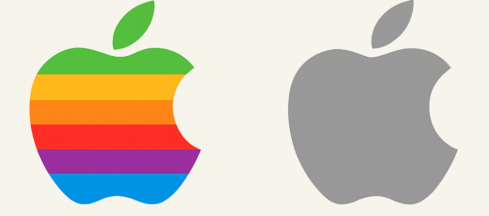
The new Apple logo.
Colors have personalities and meanings. They allow for personal expression and can evoke feelings of warmth and connection.
The shift from the vibrant, bold colors of the 1970s to the more muted, neutral palettes dominating today's cars, interiors, fashion, and product design isn't just a random aesthetic choice—it’s intentional.

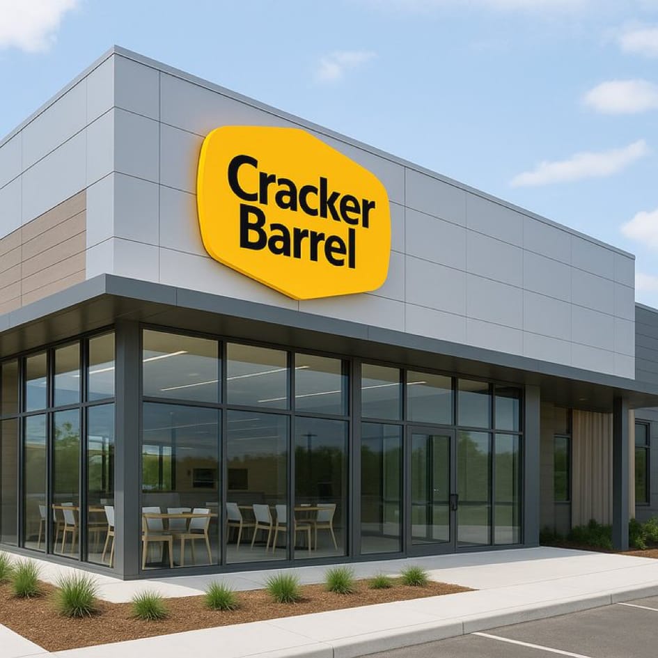
Looks like a car dealership. Will make a nice auto parts store in a few years.
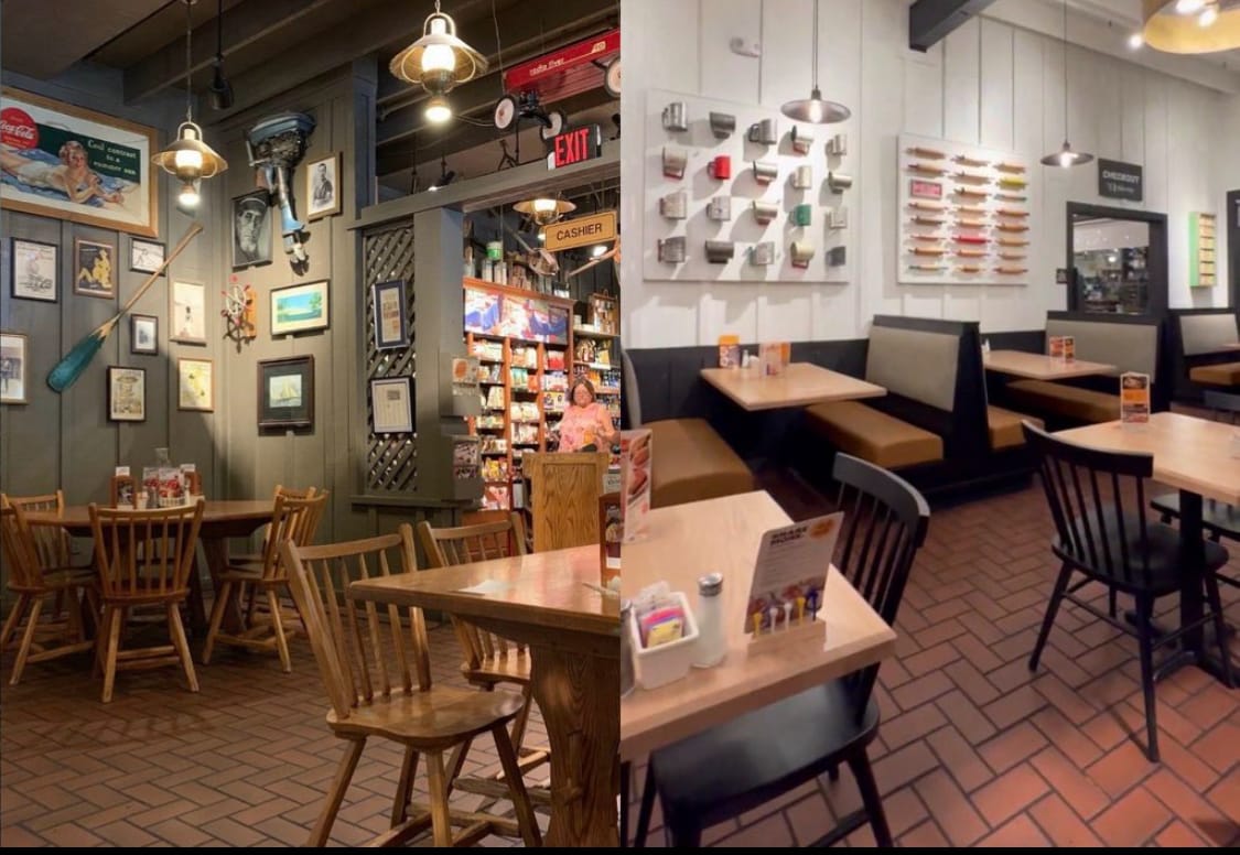
Take restaurant brand Cracker Barrel. What used to be a colorful slice of eclectic Americana is now a whitewashed, greige restaurant. It’s now closer to Crate & Barrel than Cracker Barrel. The people that drive their RVs to Cracker Barrel and wait outside in rocking chairs for 90 minutes do not want to eat at Crate & Barrel.

The newly renovated (greige) Cracker Barrel interior (right).
The announcement caused the stock (CRBL) to drop over $100 million on August 21st.
Color is disappearing from our world and it’s not just restaurants. Way back in 1908, early Ford Model T cars (1908-1914) were actually available in several colors including red, blue, green, and gray. Ford standardized production in 1914 and offered the car only in black.
“You can have it in any color you want, as long as it’s black.”
80% of new cars sold today are now grayscale, meaning black, gray, or white. Most Tesla automobiles are only available in black or white interiors. Of course, fewer options create efficiencies in manufacturing and lead to higher profits. But, is there a bigger trend here?

Art
This statue in Boston is called The Embrace. It was intended to reflect a moment in 1964 when Martin Luther King, Jr., hugged his wife Coretta Scott King after he won the Nobel Peace Prize. Seems like a wonderful concept for a statue. But, I think we can both agree that the well-intentioned artist missed their mark on this one. It’s looks like they’re holding up the world’s largest sweet potato.

Disposable Music
The chart below illustrates the greiging of today’s music. The 1970s gave us names like Queen, The Eagles, Stevie Wonder, and James Brown. In 1973, Pink Floyd released Dark Side of the Moon. Can you imagine getting a green light for that project today? Not a chance.

Today’s music sounds like background noise at a Walgreens.
Reading this article from Smartr? I’m giving free subscriptions to the next ten subscribers. Don’t miss out.
Movies & Television
Can you even remember the last movie you saw in a theater? Everything is streaming. Sure streaming television is great. But I often binge-watch three seasons of a show without even knowing it’s name. Free, network television is so unwatchable it might as well be in black & white.
Colorless Architecture
Minimalism has taken all the personality out of architecture. New buildings in cities all look like they were designed from the same template-greige concrete, black window frames. No color. I guess if the biz fails the building can be quickly converted to an auto parts store.

Can you believe that’s a Taco Bell on the right?
Public spaces are also becoming predictable. It’s hard to tell the difference between a Starbucks and a Chipotle restaurant, other than the smell of burned coffee. This is greige architecture at its peak.
Photos
We used to cherish raw, unedited moments—family slide shows with bad lighting, awkward high school dance photos. Now every image is perfectly curated, FaceTuned, and posed to death. Vibrant colors, maybe, but it’s not real life.
Comedy
Even our humor has become colorless. Late night television is unwatchable, drowned in political humor. Most of it just isn’t funny. Would George Carlin, Richard Pryor, or Steve Martin survive today? If he wasn’t in prison, do you think Bill Cosby could get a green light for a show called Fat Albert today? Could an edgy show like All in the Family get approved now? In a greige world, comedy feels flat.
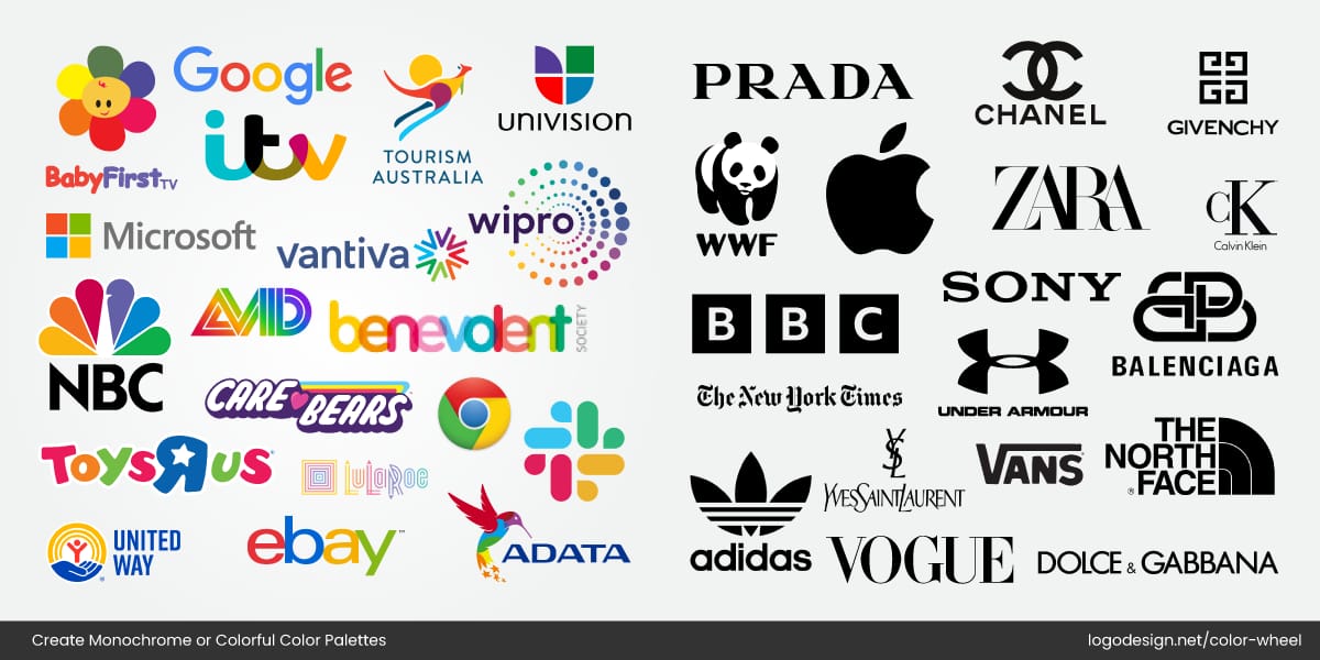
Major brands are going black and white, from logos to packaging. Strange, because the opposite of greige isn’t chaos—it’s being alive. And the world doesn’t need more calm right now. It needs a pulse.

Maybe that’s the real danger here. We’ve convinced ourselves that muting everything is the answer. That subdued, orderly, and beige is calming. But the reality is it’s not calming, it’s sedating. Just like the music in Walgreens.
Color—whether in design, music, architecture, branding, or humor—isn’t just aesthetics. It signals that life is exciting, energetic, and unpredictable. A red car or a green shag carpet won’t change the world, but it changes how you feel in it. It’s time to resist the drift toward greige. The last fifty years show that what starts with countertops and branding seeps into our everything else. We can sand down life’s edges until everything looks like an Orthodontist’s waiting room—or we can bring back color and embrace humanity’s loud, vibrant pulse.
Because humanity, at its best, has always been a little loud.
If you enjoyed this conversation, the very best compliment you can offer is to simply forward this article to someone you care about. They’ll probably like it, too.
So, did you see the color red? Have you noticed things getting more “greige”? I’d love to hear from you. Click the button below to start a conversation with me. I read and respond to ALL comments.
If you’re new to Wit & Wisdom, we’d love for you to join our community of 25K readers. The newsletter comes out every two weeks via email. It’s always free, and we are always looking for new friends. Please join us.

